With more and more shoppers turning to mobile devices for online shopping, ensuring your online store is optimized for mobile commerce is important. If not, you could be losing a substantial chunk of customers and sales. To avoid missing out on this opportunity, take a look at the 7 strategies outlined in the article for mobile optimization.
Did you know the average American checks their smartphone around 96 times a day? That’s like checking it once every 10 minutes! Apart from smartphones, tablets have gained popularity in recent years, with over 1.28 billion individuals using them for various purposes. Among the regions where tablets are most prevalent, North America leads the way with the highest number of deliveries.
This reliance on mobile devices presents an excellent opportunity for eCommerce businesses to capitalize on mobile commerce. By doing so, you can tap into the vast potential of the trend and reach more customers who are always on the go and perpetually connected to their favorite devices.
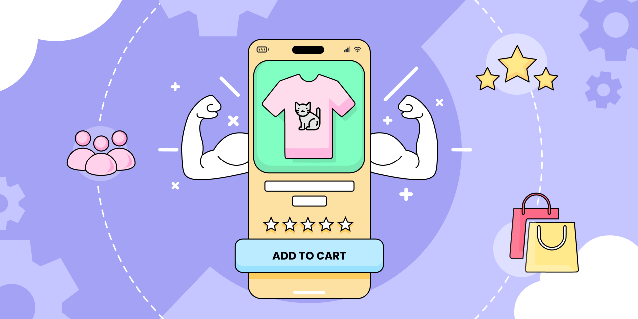
What Exactly is Mobile Commerce?
Mobile commerce, also known as m-commerce, refers to the idea of carrying out all activities related to online shopping (including transactions) with the help of mobile devices such as smartphones and tablets.
In contrast to traditional desktop or laptop browsing, mobile commerce offers a streamlined experience specifically designed for mobile platforms.
With just a few clicks or swipes, customers can browse through recommendations, add desired products to their shopping cart, and complete checkout with the help of payment getaways. It’s like a virtual shopping mall in the palm of their hands!
In today’s article, we’ll highlight why it’s necessary to optimize your storefront for a mobile-first approach and the best practices to help you create a seamless shopping experience for your customers. So, buckle up, as we’re about to begin!
Why Optimize for Mobile Commerce?
Imagine browsing an online store on your phone, excited to find the perfect product. Suddenly, you discover some buttons are missing, images are not loading, and you can’t even navigate properly. Frustrating, right? As a customer, you’ll not only get annoyed but also feel discouraged to make a purchase.
If you’re running an online store and haven’t taken steps to optimize for mobile yet, chances are your visitors are suffering the same fate! Meaning you’re losing potential customers. You’re losing opportunities!
Besides, mobile commerce is becoming increasingly popular, with the majority of shoppers using their smartphones and tablets to browse and make purchases. Recent data for Consumer Decisions reveals mobile commerce is growing at an astonishing rate, nearly 2X as fast as its desktop counterpart. That being said, it’s more important than ever for businesses to optimize their online stores for mobile use.
7 Tried & Tested Methods For Mobile Commerce Optimization
Design UI That Shines on Mobile Devices
Have you checked your website on mobile devices lately? If not, don’t wait until your visitors get baffled by those cut-off content and tiny buttons they can’t interact with.
To make your online store ready for mobile commerce, it’s crucial to design and develop an interface optimized for smaller screens and touch-based interactions. Here are a few tips to help you get started:
- Build a responsive design that adapts to different screen sizes and orientations.
- Use mobile-friendly typography and font sizes for better readability.
- Make sure buttons and links are easy to tap and spaced out properly.
- Simplify navigation and minimize the number of clicks required to complete a task.
- Use clear and concise messaging to communicate your offerings.
Ensure Lightning-Fast Load Speed
Slow and steady may win the race, but in the world of eCommerce, speed is the key. Ensure your storefront’s load speed is fast and optimized for mobile devices to keep your customers coming back. Following is a list of stuff you can consider to keep the good speed rolling:
- Optimize images and graphics by compressing them for faster load times on mobile devices.
- Reduce the size of pages larger than 5 MB by minimizing the amount of content displayed on each page.
- Choose a reliable hosting provider with fast servers to improve your load time.
- Multiple redirects on the same page can slow down your storefront. It’s best to avoid too many redirects or use them sparingly.
- Regularly test the loading time of your online store using tools like Google’s PageSpeed Insights, Pingdom, or GTmetrix.
Accelerate Your Search Performance
Mobile shoppers are often looking for specific products or offerings. Due to the smaller screen size of mobile devices, they may not have the patience to navigate multiple pages or menus to find what they need. If they can’t find what they’re looking for easily, they’re more likely to abandon your store.
A highly functional search bar is like having a treasure map to guide visitors to their desired products, increasing the likelihood of a sale. To ensure a quick and accurate search feature for your store, consider the following tips:
- Place the search bar in a way that it’s easy to find on mobile devices. Preferably at the top of the page.
- Allow customers to filter search results by various attributes such as color, size, price, or rating.
- Incorporate autocomplete, spell check, and predictive search functionality to assist customers in finding what they’re looking for.
- Optimize your search functionality for voice search, which is gaining popularity among mobile users.
- Regularly update and maintain your search index to ensure it includes all the latest products, categories, and attributes.
Seal the Deal with a Simplified Checkout Process
Your customers have made it all the way to the checkout page – congratulations! It’s the moment of truth, a critical point in a customer’s journey when they decide to purchase a product.
But a long, complicated process could be turning them off and driving them to your competitors. To prevent that from happening, simplify your checkout process as much as possible, especially for a mobile-first approach. Here are some quick tips on how you can achieve this:
- Reduce the number of input form fields required for checkout. Only ask for essential information such as name, email, shipping address, and payment details.
- Offer multiple payment options such as credit or debit cards, Google Pay, Amazon Pay, Apple Pay, and other popular mobile payment methods.
- Allow customers to checkout as guests without requiring them to create an account to reduce friction in the checkout process.
- Enable auto-fill for address and payment details to save customers time and avoid typing errors.
- Use visual cues like progress bars indicating the number of steps completed and remaining to inform customers where they are in their checkout journey.
- Enable one-click checkout for returning customers who have saved their payment and shipping details on your store.
Go Social by Integrating Social Commerce
As social media has taken over our lives, it’s not surprising that social commerce sales are projected to reach $604.5 billion by 2027.
More than half of social media users look up products on different social platforms, presenting a significant sales opportunity for your business. While taking care of mobile optimization, consider adding social commerce features to your storefront. Here are some ways to do it right:
- Allow customers to sign up or log in to your online store using their social media accounts, making it faster and more convenient.
- Incorporate social media buttons on your storefront, letting customers share products and purchase updates on their social media profiles.
- Display customer reviews, ratings, and social proof badges like “Best Seller” or “Most Popular” to build trust and credibility.
- Integrate Facebook and Instagram Shopping with your e-commerce store, allowing customers to purchase directly without leaving the app.
- Incentivize customers to refer their friends to your store by offering discounts, loyalty points, or other rewards.
Bonus Tip 1: Boost your Shopify store’s social reach with Bevy Share Cart. The app lets your customers share their personalized shopping carts with friends and followers in just one simple click!
Moreover, you can offer incentives in the form of discounts to encourage more cart shares and checkouts from your store without investing in marketing efforts.
Give Those Pop-Ups a Break
Pop-ups can be effective for increasing conversions and capturing leads in your store. However, when it comes to mobile commerce, less is definitely more!
Too many pop-ups can be a major annoyance for customers due to small screen sizes, leading them to abandon your site. Here’s what you can do to strike a balance with pop-up usage and hit the sweet spot of your mobile visitors:
- Limit the number of pop-ups on your storefront. Make sure they are relevant to the user’s browsing session.
- Consider using exit-intent pop-ups that appear when the user is about to leave the website. As they are less intrusive and can be effective in capturing leads or offering discounts.
- If you must use pop-ups, ensure they are easy to dismiss and do not cover useful content or navigation menus.
Bonus Tip 2: Use a tool like Bevy Design if you want to use pop-ups on your desktop site but don’t want to risk annoying mobile users. The app lets you hide pop-ups for desktop and mobile displays. Meaning you can capture leads on your desktop site without disrupting the mobile user experience and the other way around.
Bonus Tip 3: Consider using Bevy Notifications to notify customers about deals and discounts instead of relying on pop-ups. With this app, you can deliver targeted push and tab notifications without interrupting their browsing.
Offer Exceptional Support to Your Customers
Do you provide the same level of customer support on mobile devices as you do on desktop? As now most people shop online using smartphones and tablets, you must offer prompt and friendly support across all devices.
Statistics suggest around 83% of customers require some form of assistance during their online shopping journey. The following optimizations can help you make your store ready for top-notch support:
- Implement a live chat feature on your storefront to provide real-time support to customers.
- Ensure the live chat feature is easily accessible and visible on all pages of your online store.
- Offer email support as an alternative for inquiries that require detailed explanations or attachments.
- Include clear instructions for contacting customer support, including email address and chat support hours.
- Integrate automated chatbots to handle basic inquiries and free up your support team’s time for more complex issues.
- Provide a comprehensive FAQ section on your website to help customers find answers to common queries.
Before We Say Goodbye
Congratulations again! You’ve made it to the end of the article. Now, if you’re running an online store and feeling overwhelmed with the task of optimizing it for mobile commerce, there’s no need to fret.
The team of expert UI/UX designers and developers at Bevy Commerce are ready to help you create a sleek and seamless version of your storefront that’s tailor-made for mobile devices.
Get in touch with our support and see the difference we can make for your mobile commerce strategy!


